
Timeline
Aug - Sep 2024
Role
Lead UX designer
Employer
Optum
Nuvaila
Designing a brochure-style web presence and patient copay experience for a new biosimilars commercialization brand.

Team composition
UX Design
Lead UX designer + 1 support designer
UI Design
1 visual designer
Content
1 copywriter + 1 Nuvaila editor
Partners
Nuvaila leadership & Optum B2B leads
The goal of this project was to build the foundational digital experience for Nuvaila, a pioneering B2B liaison in the emerging biosimilars market. Operating under an aggressive one-month timeline for a high-stakes industry conference, the challenge was to build a professional, authoritative microsite that could effectively communicate Nuvaila's value proposition to pharmaceutical manufacturers, PBMs, and health systems.
By applying an object-oriented UX (OOUX) framework and a rhetorical page design philosophy, I transitioned the site from a general brochure to a targeted B2B lead-generation tool, prioritizing professional authority & positioning in a marketspace with virtually no established digital conventions.
Nuvaila required a digital identity in a nascent market where no established user mental models existed. As the biosimilar market expanded due to expiring biologic patents, Nuvaila needed to position itself as the essential link between manufacturers and providers.
This challenge was compounded by three critical constraints:
1
Extreme ambiguity
Only one primary competitor with a limited, bare-bones experience and no industry benchmarks for successful web conventions.
2
Fast-paced delivery
A strict one-month timeline for launch for a full website, ready to showcase at a high-stakes industry conference.
3
Audience prioritization
Balancing the need to appeal to high-level B2B stakeholders (manufacturers & PBMs) while maintaining a secondary awareness of the patients who ultimately rely on these drugs was paramount.
The strategic goal, therefore, was to leverage this lack of competition and trailblaze the marketspace by creating a professional, standard-setting environment that signaled reliability and expertise to potential business partners.
Scope & parameters
Defined & established a category standard in the absence of industry benchmarks.
Managed an end-to-end design and launch cycle within a strict one-month window to align with a high-stakes industry conference.
Shifted the sitemap from a general brochure to a targeted lead-generation tool for building new business partnerships.
Employed an object-oriented UX (OOUX) framework to structure a professional, authoritative site in a novel market environment.
Proposal & refinement
Information & partnerships
The initial objective for the Nuvaila site was to create a general-purpose brochure that introduced the company and its offerings. However, as the sitemap began to take shape, it became evident that the primary utility is in establishing business partnerships.
In collaboration with Nuvaila’s marketing and content representatives, I conducted a critical review of the intended user journeys & the potential calls-to-action (CTAs).
Audience scope
While there was an initial desire to provide resources for the patients who would ultimately use biosimilars, a strategic analysis revealed that patients typically interact with these services through their healthcare providers rather than directly through a B2B liaison.
Including prominent patient-facing content without a clear, actionable path for them risked creating a fragmented user experience & a distraction from the site's primary business goals.
Focused architecture
I advocated for a pivot toward an audience-centric architecture. Instead of organizing the site by product or feature, we structured the navigation around the specific needs of the primary stakeholders: pharmaceutical manufacturers, PBMs, and health systems / independent pharmacies.
By narrowing the scope, we created a leaner, more intentional navigation structure. This shift transitioned the site from a passive informative resource into a targeted lead-generation tool. The final sitemap focused on building trust with B2B partners and providing a clear, frictionless path to establish new business relationships.
The design of Nuvaila's microsite was guided by a commitment to a strong information architecture (IA) & a clear, rhetorical page structure. The goal was to ensure that every element on the page served a specific purpose in anticipating stakeholder curiosity and compelling them into exploring a partnership.
Beyond the structural IA, I treated the layout of each individual page as a rhetorical argument. Recognizing that B2B trust is built through a specific sequence of information, I organized the page flow to mirror an essay's progression:
Exposition: The hero & introductory sections were designed to clearly define Nuvaila’s brand & role in the biosimilar market.
Evidence: The middle sections of the pages fleshed out the details & value propositions to demonstrate how Nuvaila benefits its partners and patients.
Conclusion: Strategically placed CTAs that provided a frictionless transition from "information gathering" to "partnership initiation."
By combining OOUX for structure and a rhetorical model for content delivery, the microsite transitioned from a passive brochure to an active tool for building partnerships.
Information architecture
Applied an object-oriented UX (OOUX) framework to diagnose core objects for manufacturers, PBMs, and partners, prioritizing the IA based on audience-specific business goals and stakeholder needs.
Signal-to-noise optimization
Leveraged NN/g (Nielsen Norman Group) principles to engineer a compact sitemap, utilizing strategic white space & with focused content to elevate key value propositions and primary CTAs.
Component library
Operated within a limited in-house component library, maximizing the utility of restricted card and button variants to create a cohesive, reusable pattern system across the microsite.
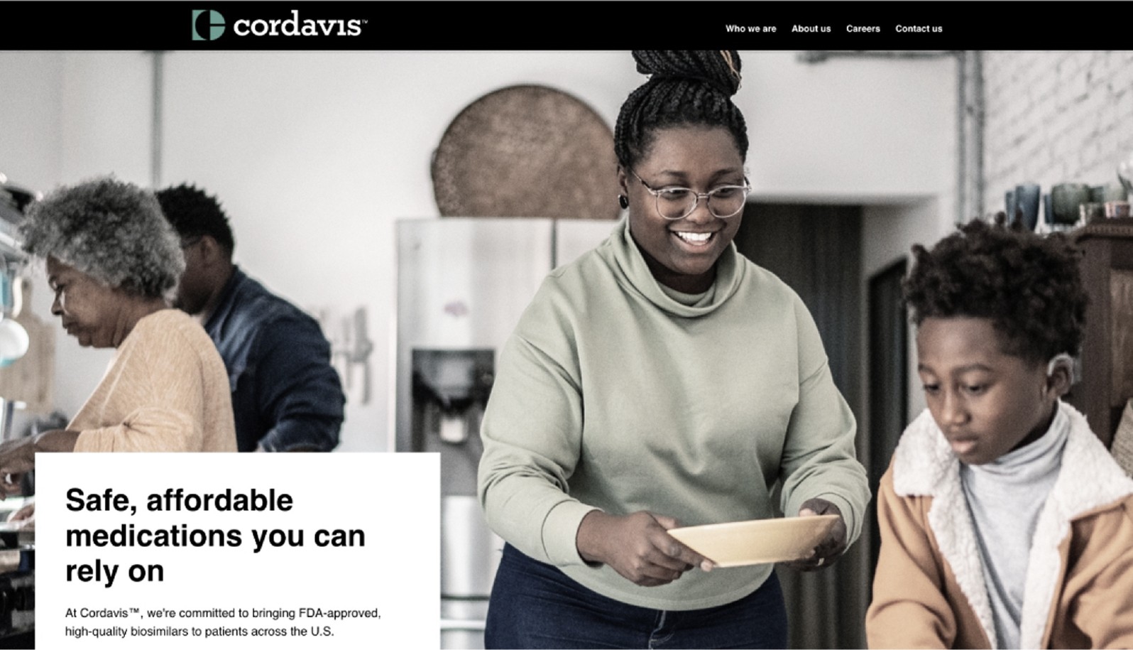
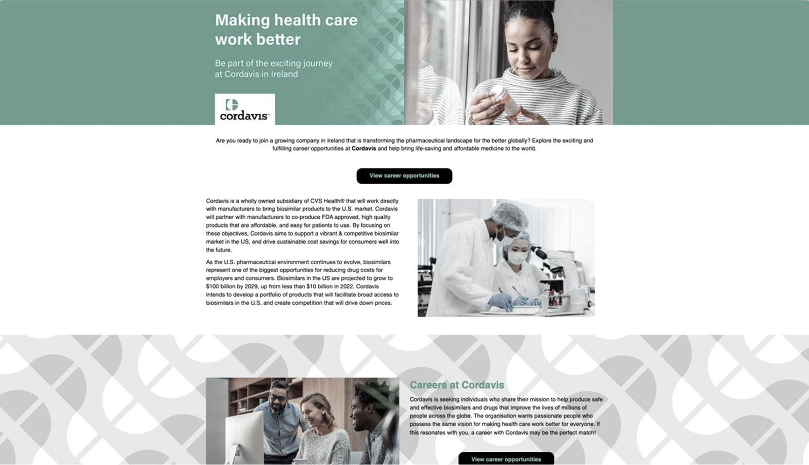
Competitor analysis
Cordavis | Home
Cordavis | Careers
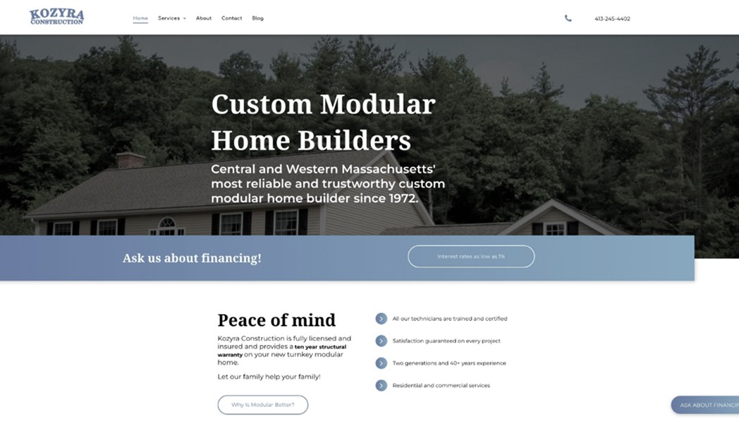
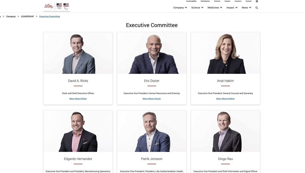
Brochure-site inspiration
Kozyra Construction | Home
Lilly & Co | About

Lilly & Co | Executive Committee
Desktop wire | Home
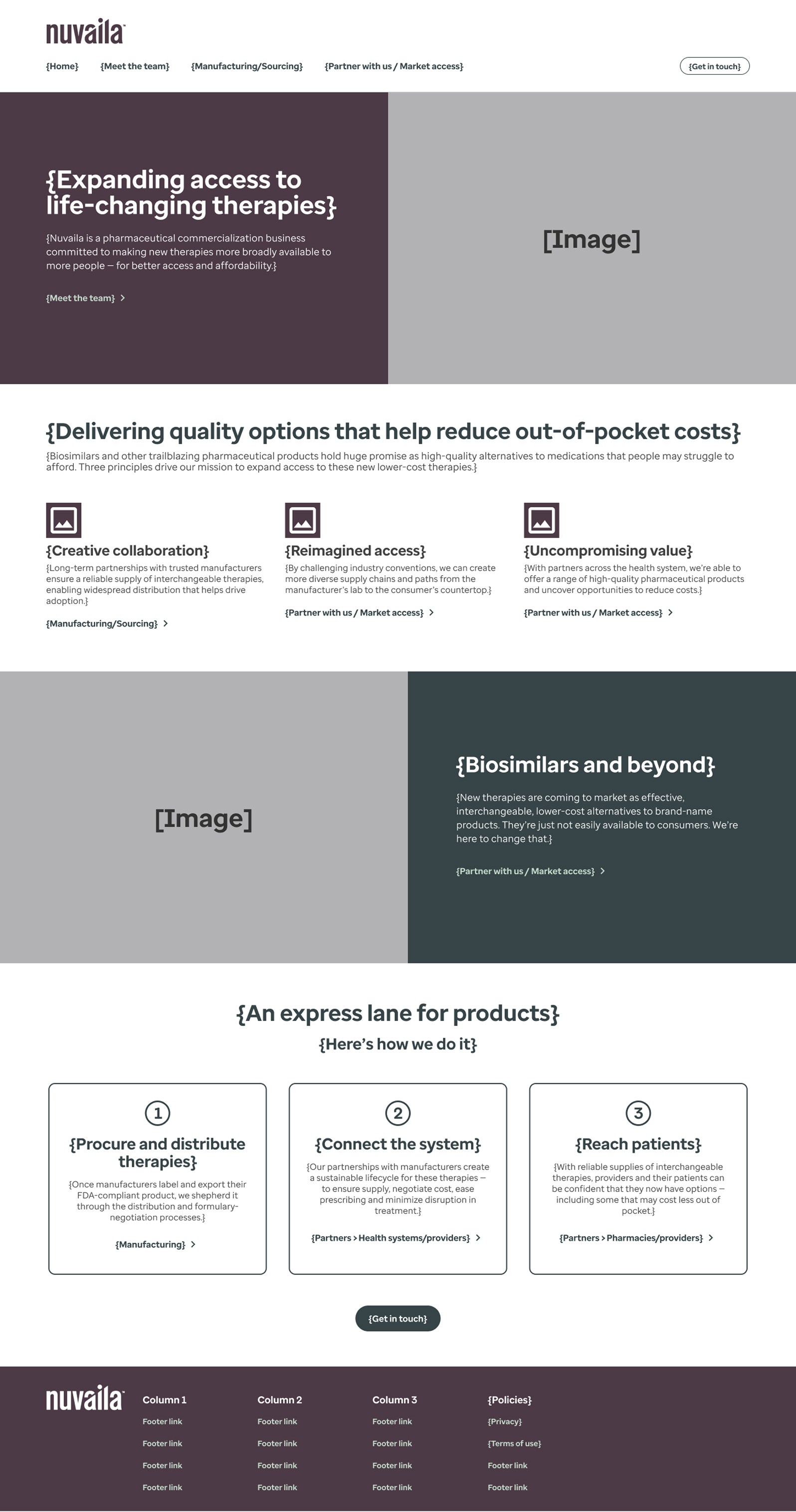
Structural blueprint
The foundational wireframe established the site's OOUX-based architecture, prioritizing the 3-step rhetorical argument: exposition, evidence, and conclusion.
By defining core objects and high-level CTAs early, I ensured the sitemap provided a frictionless path toward B2B partnership initiation.
Nuvaila | Home
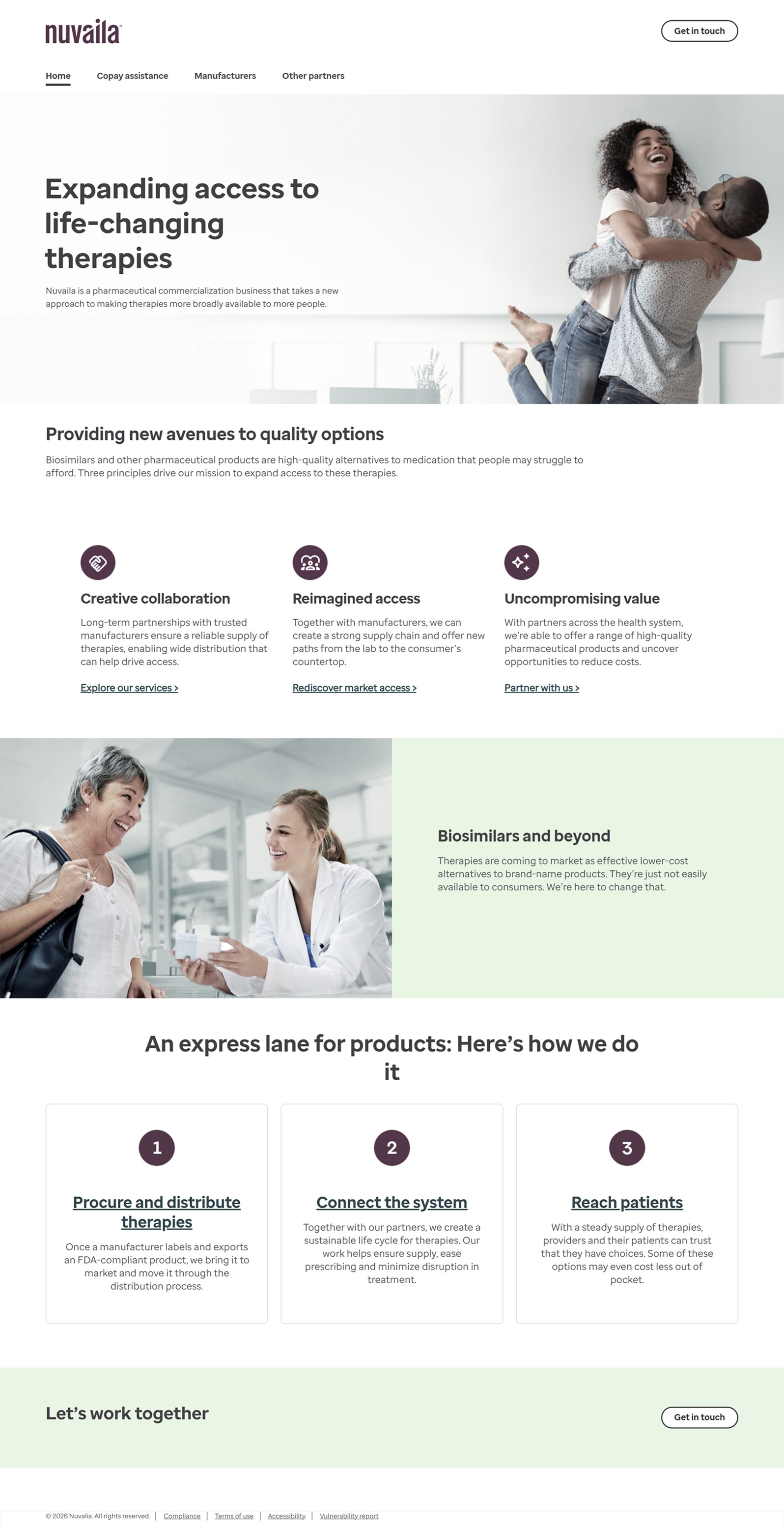
Pioneer branding
The final visual execution translates the structural blueprint into a polished digital presence with clear content establishing Nuvaila's role & brand.
The layout reinforces Nuvaila as a pioneering liaison in the biosimilars market, utilizing professional visual cues to establish confidence with potential partners.
Nuvaila | Manufacturers
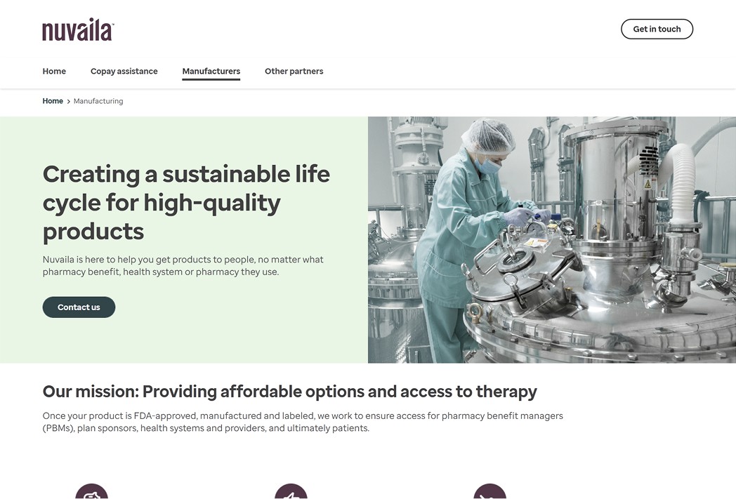
Focused architecture
This audience-specific page demonstrates the focused sitemap architecture, providing a clear route for stakeholders to find specific information pertaining to their needs.
Thus, the design delivers a targeted value proposition that demonstrates Nuvaila's ability to optimize market entry & partnership efficiency.
Nuvaila | Partners
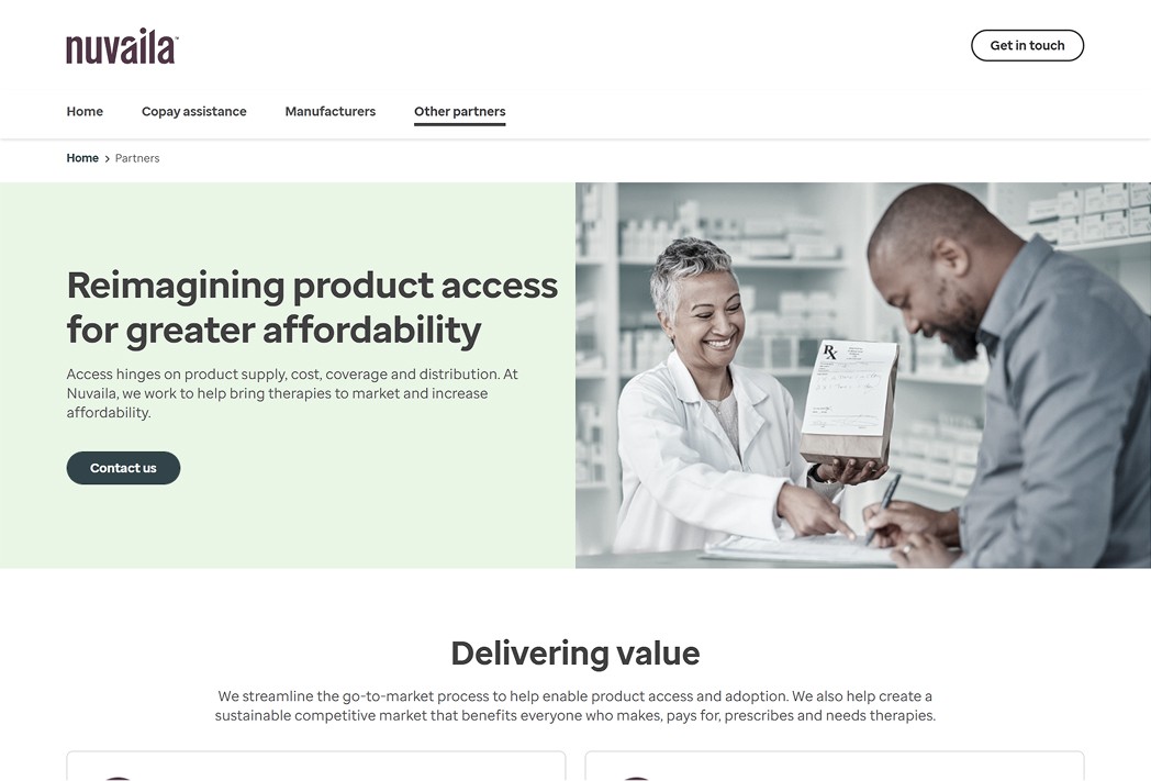
Audience scope
Utilizing the audience-centric pivot, this page caters specifically to PBMs and health systems. The IA is designed to address the unique pain points of these stakeholders, ensuring that the presented content is relevant to their specific operational goals.
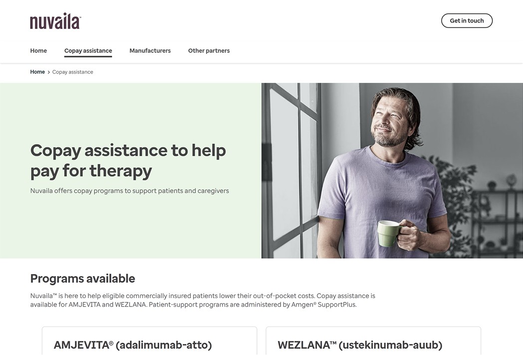
Nuvaila | Copay assistance programs
Patient-focused utility
The introduction of the copay assistance page extends the site's utility beyond simple information and addresses the primary consequential audience: patients.
This feature provides a tangible value-add for partners & patients, transforming the microsite from a passive brochure into an active resource for financial accessibility in the biosimilars market.
The most enduring lesson for the Nuvaila site was the challenge of designing in a vacuum. When there are no established industry benchmarks nor user research to lean on, the aim then is precision & clarity for content while leveraging analogous best practices in related designs.
The project demonstrated that in the absence of data, professional rigor and a proven content strategy (e.g., object-oriented UX) are the optimal ways to mitigate risk. The success of the site wasn't found in the visual polish, but in the ability to translate a vague business goal into a concrete, authoritative experience under a fast-paced delivery timeline.
Ultimately, this project reinforced my belief that high-seniority design is about clarifying ambiguity. The best of novel experiences remove the guesswork for the user, replacing uncertainty with a related mental model & transparency to build confidence. Moving forward, I view the lack of a "standard" not as a hurdle, but as an opportunity to define the standards & conventions for the industry.
Strategic outcomes
Successfully established a professional digital presence for a trailblazer in the biosimilars market, providing a confidence-building platform for potential B2B partners.
Transitioned the site from a passive informative resource to a targeted lead-generation tool, streamlining the path from "information gathering" to "partnership initiation".
Implemented an OOUX-based architecture that allowed the site to be launched in under one month while remaining scalable for future audience expansions.
Eliminated fragmented content in favor of a focused, audience-centric IA, increasing the signal for high-level stakeholders (i.e., manufacturers, PBMs, and health systems).